#57 - The Rules For Making Art Are Actually More Like Ingredients For A Meal - You Get To Choose Which Ones You Want To Add Or Leave Out Of Your Creative Process
One way of looking at the rules of art making.
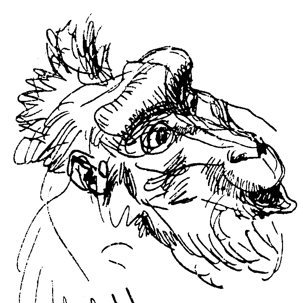
YouTube Video - Pen and Ink Drawing From Heinrich Kley Reference Sketch While I Talk About Art Rules
You have probably heard of many rules of art, and I want to focus on one specific one because I think it is instructive.
The rule I want to take a closer look at is the rule that you should avoid tangents.
What are tangents? Tangents are when the outline of two different things touch. In animation circles, tangents are seen as bad because they reduce the sense of depth in an image.
There aren’t as many tangents in nature, but for some reason, we find them irresistible while drawing.
Here’s an example article that explains that you should try to avoid tangents .
But, I had seen a painting where the subject touched on the edges of the painting, and it successfully created a sense of that person being enclosed.
If you are making art for the animation industry and you know they will also evaluate your work in terms of whether there are tangents, then, by all means, remove as many tangents as you can because that is what is important to be successful in that space.
But that doesn’t mean that it always holds.
I don’t see it as a rule but rather as an ingredient. You can put in more tangents or fewer tangents. It’s just an ingredient you can add to your piece.
For example, look at this video where the experienced artist explains why a painting is so good. And also, notice all the tangents in there! The head of the child touches the carpet, flattening the image. The side leg of the sofa the woman is reclining on touches the edge of a wall behind her. In the front is a wall that touches the side of a wall in the background. The woman’s head touches the edge of a wall behind her. The painting is full of tangents, and yet it is successful.
When you cook a meal, you don’t throw all the ingredients you have in your kitchen into one pot! It would not taste nice. You add the ingredients that go well together, and you taste the dish, and then you add more of one ingredient or the other.
Whether you add more or less of an ingredient is an artistic choice. It is not a rule and never a must.
Don’t trust people who tell you such certainties: that you have to do things such and such in a certain way before they find out what you want to achieve in the first place. Maybe their “rules” do not apply to your work. Maybe they demand you use an ingredient that would not work in your art.
On a side note, it has been my contention for a long time that we remember artists not because their work was so good but because they found a new ingredient that artists could use. An example I always like is how Cézanne solved a problem. They had just invented the tube of paint, and they could paint outside, and they discovered that lighting outside was radically different from the light in a studio. In a studio, you’d have a lamp, and you’d have primary lighting, secondary lighting, and big shadow shapes, and as an artist, you could mold and change these large shadow shapes to make them into pleasing compositions. But now they discovered that things were more flatly lit outside, and there were often no large shadow shapes! What to do, what to do!
So Cézanne set out to solve that problem. How do you get “design” back into your painting if you don’t have these large shadow shapes to play with? And he came up with several solutions. One I like is that he lets go of the accuracy of the outline of objects. “Accuracy of the outline of objects” is an ingredient. He decided to put less of that ingredient into his paintings and add more of the “control over the abstract shapes of the design” ingredient.
Here’s another set of contrasting ingredients. In the past, when masters added dark areas to their paintings, they never went full-black. They wanted to remain able to suggest the volume and texture of objects, so they went almost, but not entirely, black. To still be able to suggest volume and texture was an ingredient they valued.
Then along come comics. Comics are printed, and especially in the beginning, print quality was awful. Thin lines would disappear. Thick lines would blend into black areas. The first artists did try to suggest volume and texture through cross-hatching. People like J.C. Coll and such tried. I’ve seen the printed versions. What printing did to their work must have driven them to insanity. So, later, Noel Sickles, while drawing newspaper strips, came up with the idea of creating large patches of black shapes, now called black-spotting. Black spotting became that ingredient that replaced the other one. Artists could now add large patches of black shapes, make it look good even in print, and control how it looked. And it was faster than cross-hatching all these areas.
Your art will need different ingredients for the various purposes you make the art for.
You can try the following with tangents today: make a quick sketch of a scene trying to have as many tangents as possible, and then sketch that same scene with as few tangents as possible. You should notice that the piece without the tangents has more of a sense of depth, and the one filled with tangents feels flatter. One is not necessarily better than the other. See that images with tangents can be fine too. It depends on what you are trying to achieve.
I want to move to adding real drawing exercises in each article, and this is the first one!
The above video shows me drawing a monkey’s head with pen and ink. I based it off this reference, a pen and ink sketch made by Heinrich Kley.
What you’ll notice is that it is completely silent. I can spend a lot of time creating audio, or... I can draw. I decided to make more time to draw. And do you miss the audio, really? There is an essay on screen which you can read. I make it go really slow so you can watch me drawing after you read the slide. I need to tune things a bit, but I think it can work!
Did I hear someone in the back of the room ask what pen I used? Glad you asked! Well. It’s a Brause X3 Steno dip pen. I got this tip from a recent online course Marshall Vandruff gave and it has instantly become my favorite! The pens I used before this one were either stiff mapping pens that had little line variation, or they did have line variation, but that meant they had a fine tip that could catch in the paper and splatter ink; you can only draw by pulling the pen with these, not by pushing.
The Brause Steno X3, however! It is sturdy, and the tip bends down a bit, which means you can push the nib without catching paper. Makes sense, as this pen is designed to write with. I can’t believe I hadn’t thought of trying writing nibs before. I thought a nib specifically designed for drawing would be ... better for drawing... But apparently not. Lesson: always experiment.
The ink I use is brown umbre, made of tree soot, and it is just a beautiful, luscious, deep, saturated brown. It’s the ink Rembrandt used, so, you know, use the same materials, get the same quality results, right? Haha.
This ink holds well on all paper I ever tried it on! It never, ever, ever, ever bleeds. I have drawn on the cheapest newspaper with it and it does not bleed at all. Indian ink is a much darker ink, but it can be particular about the paper it wants to be used with. All paper is fine! As long as it’s 7 ply Bristol board. No biggy. Indian ink bleeds much faster.
You didn’t ask about the ink I used, but there you go.
Experiment!
I originally wanted to draw directly in pen and ink from memory, but decided not to. This drawing was surprisingly hard! I did do the blue pencil line art from memory, after practicing this head many times.
Here are some pointers if you decide to try drawing from this model:
1. Be careful with the placement of the eyes. They have to be aligned, and, as you can see, they are also wrapped around a sphere.
2. the mouth section seemed to be a bit skewed to me. Heinrich Kley’s drawing looks fantastic, but I fould I had to straighten it a bit to make it look okay in my drawings.
3. This is a personal preference, but I think I prefer it when the nose is a bit shorter. At any length, you can experiment with that.
I’d post a weekly reference image for us to pick apart and practice drawing from. My website’s name, “Practice Drawing This”, would have meaning again.