FREE Comics Course
Index Of LessonsLesson 7: Thumbnails
The reason to keep these small is that you force yourself to solve the big problems. You can not add much detail if you draw small.
Drawing thumbnailsLoading... for comicsLoading... page designs is the hardest part of the comicsLoading... creation process.
Drawing thumbnailsLoading... for comicsLoading... page designs is, I think, the hardest part of the comicsLoading... creation process. Writing is about feeling the storyLoading.... Frankly, it should be the part where you get to play around. Drawing the pages is about zoning out and putting down lines. It can be very meditative. But when you design pages, you have to really put your thinking cap on! You have to tell the storyLoading..., think of the pacing, how the eye is guided through the page. You have to consider the mood and tone of the page. Do all the panel details fit? Do the word balloons fit? Are the shots and poses and abstract panel designs helping to tell the storyLoading...? This part of the process is also the most creative part, visually, and it is a lot of fun.
Don't fall in love with your first design.
1) Do the panels fit on a page? Does all that detail that is described in the scriptLoading... fit into the panels? Will there be enough space for the word balloons?
2) Is the pacing right for the page? Large panels slow the reader down, and small panels speed up the reading process.
3) Where will the word balloons go?
4) Is the eye guided through the page effectively? Is there a natural line the eye will follow through the page as the reader reads? Consider that the eye goes from left to right and moves down the page. It is the natural way we read. Make sure elements are placed along a reading line so that the storyLoading... flows naturally through the page.
5) Do you want dramatic action shots with lots of wide-angle views heavy on perspective, with shots from many different angles, or do you want a calmer feel, the camera always at eye height?
6) Consider also how you want to stage and frame things: An establishing shot is from far away. You can move in to bust shot or to a close-up of a face to show emotion. Also, it matters what texture the background has as that can evoke an emotion. Relative heights, one character towering over another, can suggest relative strength and power. When a character is in a pickle, you can make surrounding shapes seem like they are closing in on that character, et cetera.
7) You can start to solve lighting at this stage. Lighting can have a significant impact on the mood of the page.
8) Acting. You can start to solve how the characters act out situations.
9) Also, put the thumbnailsLoading... next to each other and design the whole storyLoading... as one ‘musical’ composition.
10) Don’t worry about legibility of your thumbnailsLoading...: you’re the only ony who needs to be able to read them. They don’t need to look good. As soon as you embrace this notion, it can be incredibly liberating to not have to make good-looking drawings! Just quickly note down ideas. Draw stick figures for characters if you have to. This can be the hardest part of the process, the part where you think it through, come up with the design. This is work, but it is also fun!
By the way, it is okay if you, during the thumbnailing stage, discover that something doesn't work. You can go back to the scriptLoading... and change it! It's the final product that matters.
The design process works as follows:
1) You define the problem (the pages that need designing, their required feel, et cetera)
2) You gather ideas by making lots of quick thumbnailLoading... sketches. These are prototypes. Don't fall in love with your first design. Draw many ideas. Push ideas. Try different approaches. Make AT LEAST three thumbnailsLoading... for each page. If you think a thumbnailLoading... is good, make another one anyway where you push it further. I find that I draw a few options for each panel first before I combine them in a page.
3) Leave the designs for a few days, then look at them coolly. Consider what you do and don't like about these design prototypes and develop some more designs until you are happy.
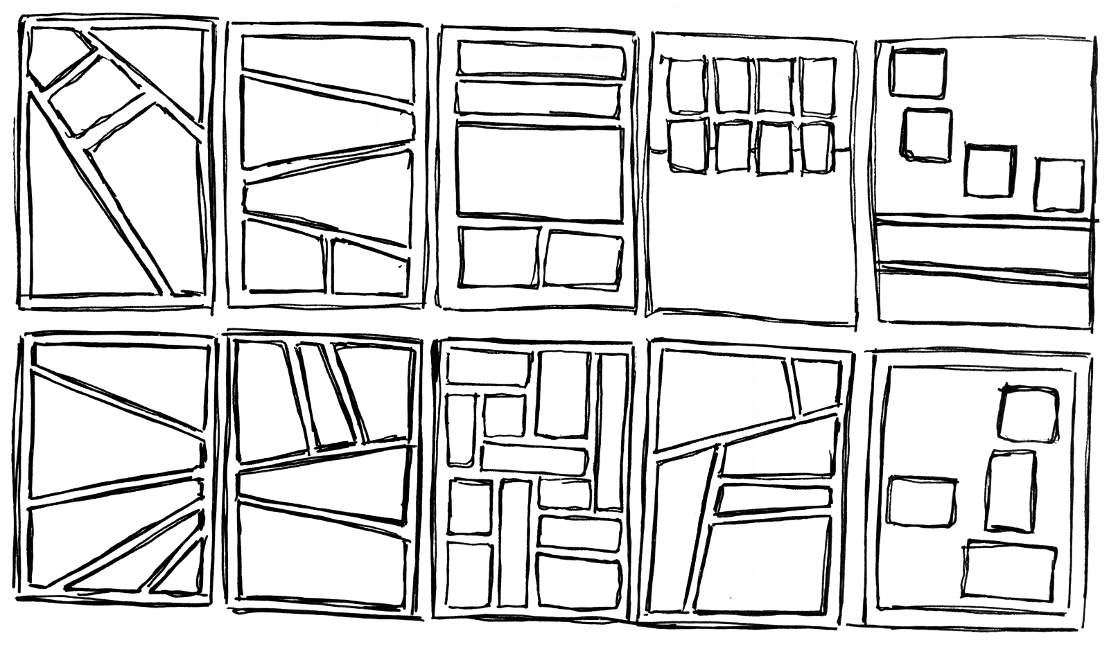
Grids
For page layouts, you can consider regular and irregular layouts.Regular layouts are often grids of panels. For example, a nine-panel grid can be organized as three rows (called tiers in comicsLoading...) of three panels each. Another popular one is a six-panel grid where three tiers have two panels each. You can use square panels for that. Lastly, you can use a sixteen-panel grid on a larger page, four tiers with four panels each. One advantage of the sixteen-panel grid is that since each tier has four panels, each tier can be a mini-storyLoading... all unto itself, like a comicLoading... strip.
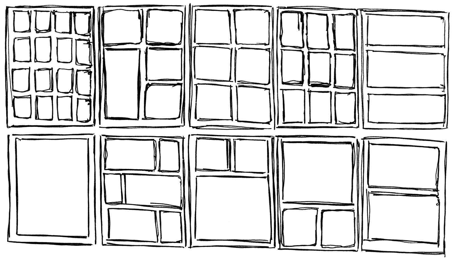
You can break the grid: you can combine panels into bigger panels, or make sone panels wider and others narrower. The point is to create a regular grid of rectangular boxes that extend in two directions, and to align panel borders to them.
For the irregular grid, anything goes.
You don't have to do each page the same way. On the contrary, you should consider making each page different. Make it visually interesting, vary it up a bit.
Study Existing Comics
One useful thing you can do is take existing comicsLoading... or graphic novels — especially ones you like — and make thumbnailsLoading... of these pages to see how and why they work. You might pick up some things you might want to use in your pages. Did they use a grid? How did they place the word balloons and other elements to guide the eye through the page? How and why did they vary panel sizes? Did they use many dynamic camera shots, or not? Did they use abstract design in the panels to help convey the storyLoading...?Can I do thumbnailsLoading... digitally?
You most certainly can! Digital is actually a very good way to do it. You can very easily cut parts out or move or resize them. And when you are finished, you can take the thumbnailLoading... you like, paste it into a separate document, increase its resolution, and then later you can just add another layer on top of it where you start to refine the drawing. Drawing digitally is so comfortable that it sometimes feels like cheating to me. But it isn't cheating. The end result is what counts!Assignment
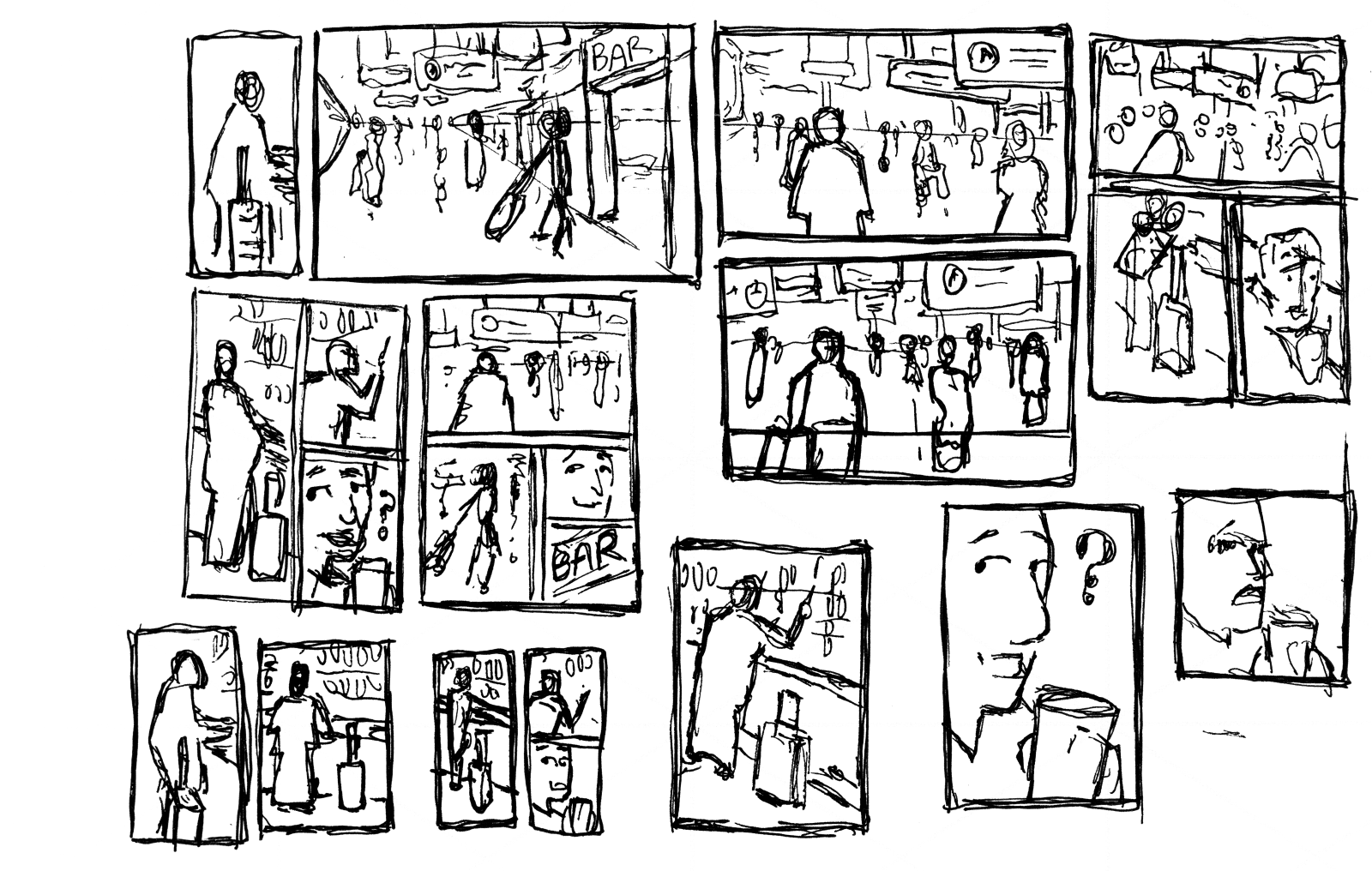
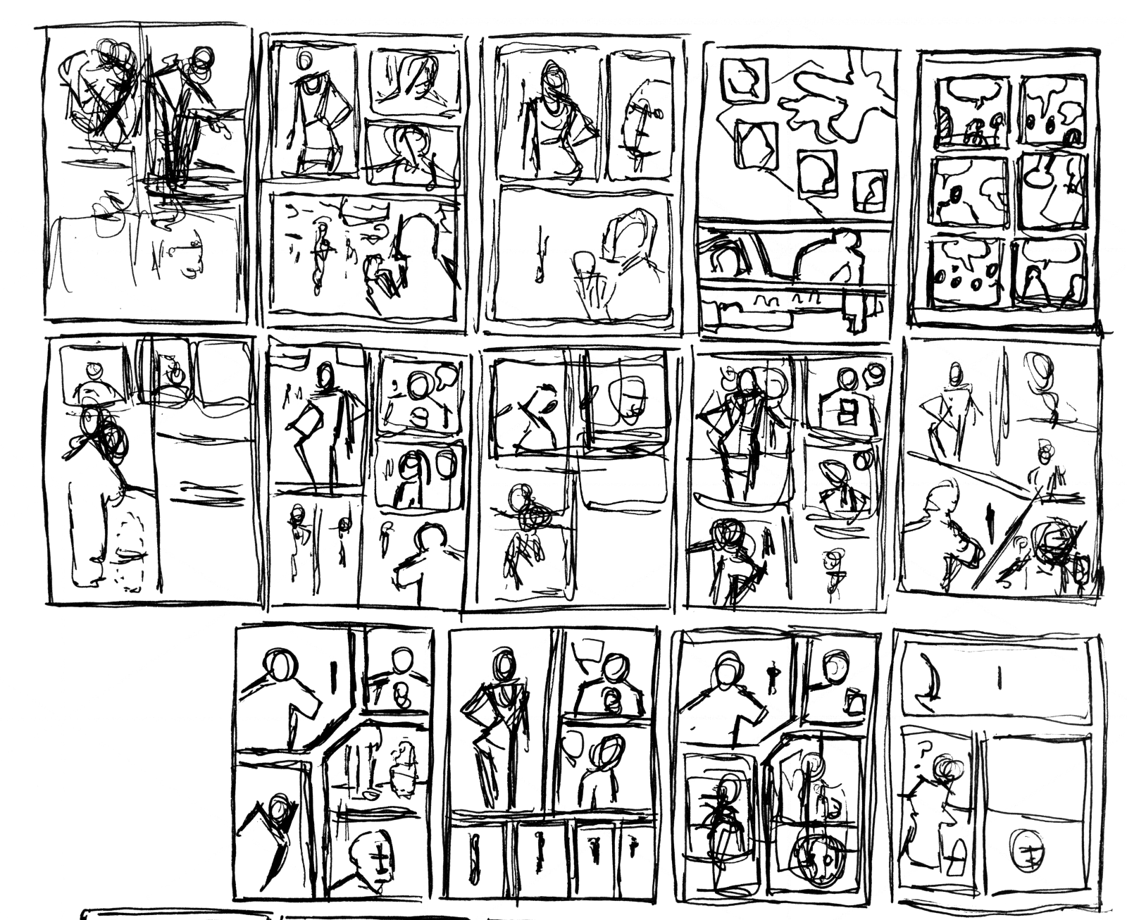
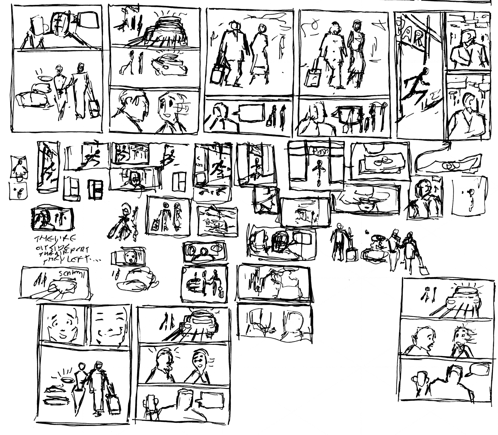
Read your scriptLoading..., printed out on paper if possible, and as you read it, draw small thumbnailLoading... sketches of the first page-layout that comes to mind. You can doodle them in the margins of the scriptLoading.... Alternatively, take a separate sheet of paper, and sketch them there. Here, you already find out if everything can fit on a page. You will see how I did below. I had to combine panels so that there were fewer panels to draw on the page.Look at the thumbnailLoading.... Try to imagine it being a full-blown comicsLoading... page, and try to read it. Is your eye guided through the page? Does the pacing feel right?
Try to figure out what is wrong. Are there panels that have too much information or that need to be bigger? Or are there too many panels, is there too much detail? Can you solve it by combining panels and using fewer panels per page?
Make new thumbnailsLoading.... Come up with radically different ideas. Don't fall in love with your first design. It will often be a lazy and obvious first idea. If you do like the design, make new thumbnailsLoading... anyway, where you try to push the design further. Can you make the poses even more expressive, for example?
You can do this as an exercise also here:
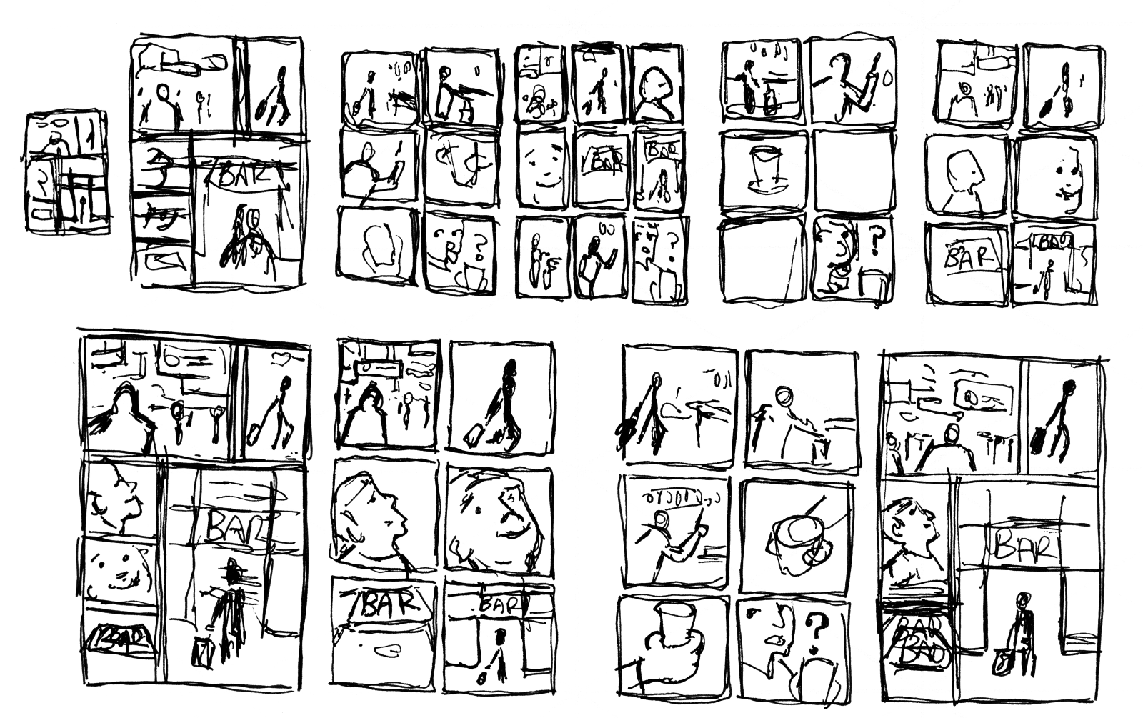
I will do this course along with you, and here are my thumbnailsLoading....
First, I tried out many different options. I drew these directly with a pen, and decided to draw different options for the panels first in some cases.
The Script
During the thumbnailing stage, the script changed quite a bit. For one, I decided to render each of the four part on two pages instead of one. The third part worked better on one page, and the fourth part worked better on three pages.I expanded the page count from four to eight. You might not always be able to do that. For print, you typically have a fixed number of pages, because printing pages costs money. For the web, however, it is different. Space is free.
I decided to go for fewer panels per page, and a 4x5 aspect ratio because it would be a natural fit for sharing on some social media platforms. I wanted to try and see how that pans out.
The altered script can be find below, along with the “final” thumbnail for each page.
Going Places
Page 1
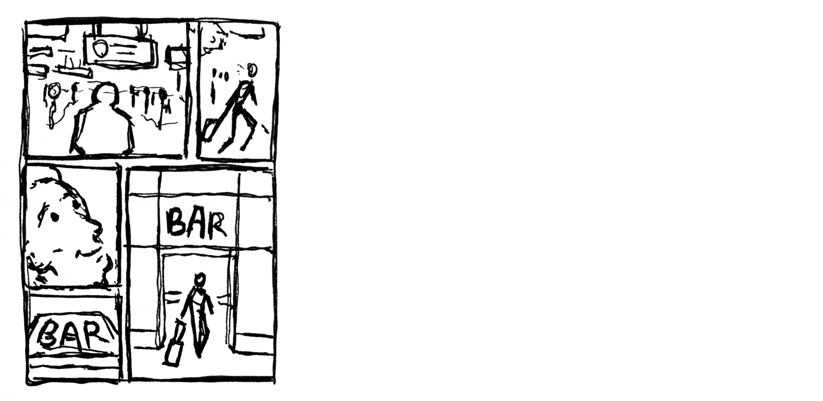
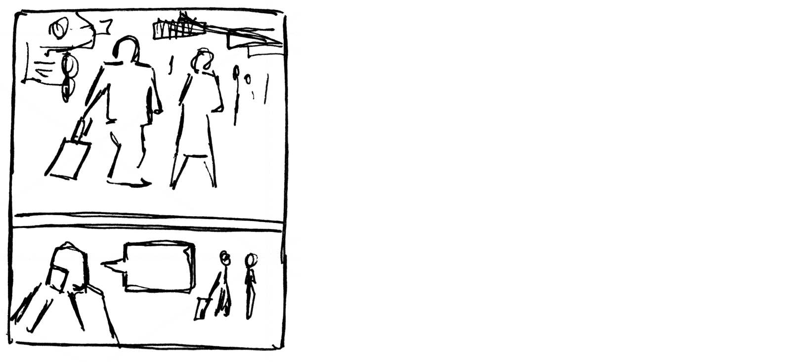
Panel 1: Establishing shot of Jack, in his 40s, who is walking inside an airport. Many travelers are walking in all kinds of directions, the standard airport indication signs above their heads.
Panel 2: Jack is walking, and pulling along a carry-on suitcase.
Panel 3: Jack is looking up with a smile on his face as if he is happy to have found something.
Panel 4: Shot of a “BAR” sign, one of those bars at airports you find before check-in.
Panel 5: Jack is strolling into the bar.
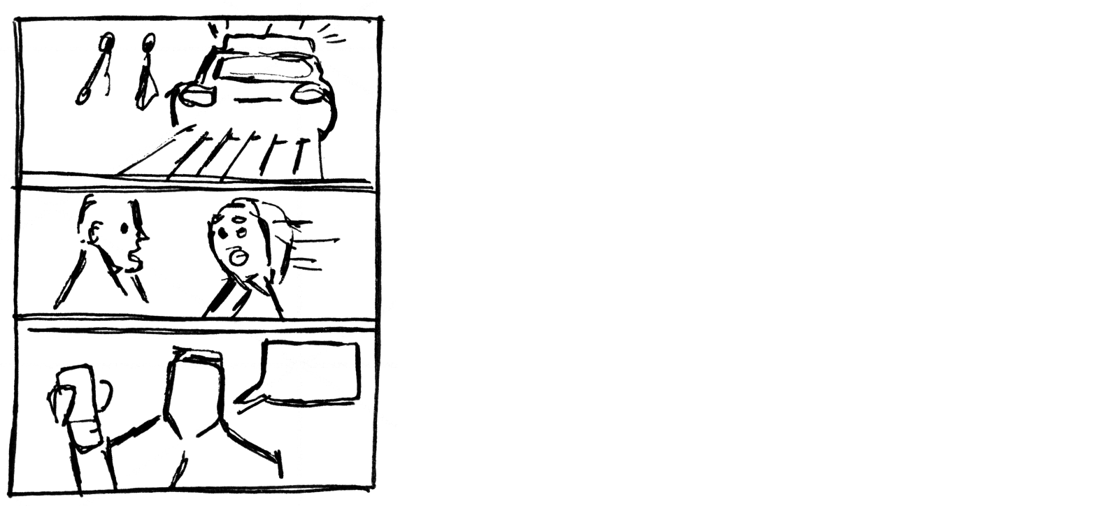
Page 2
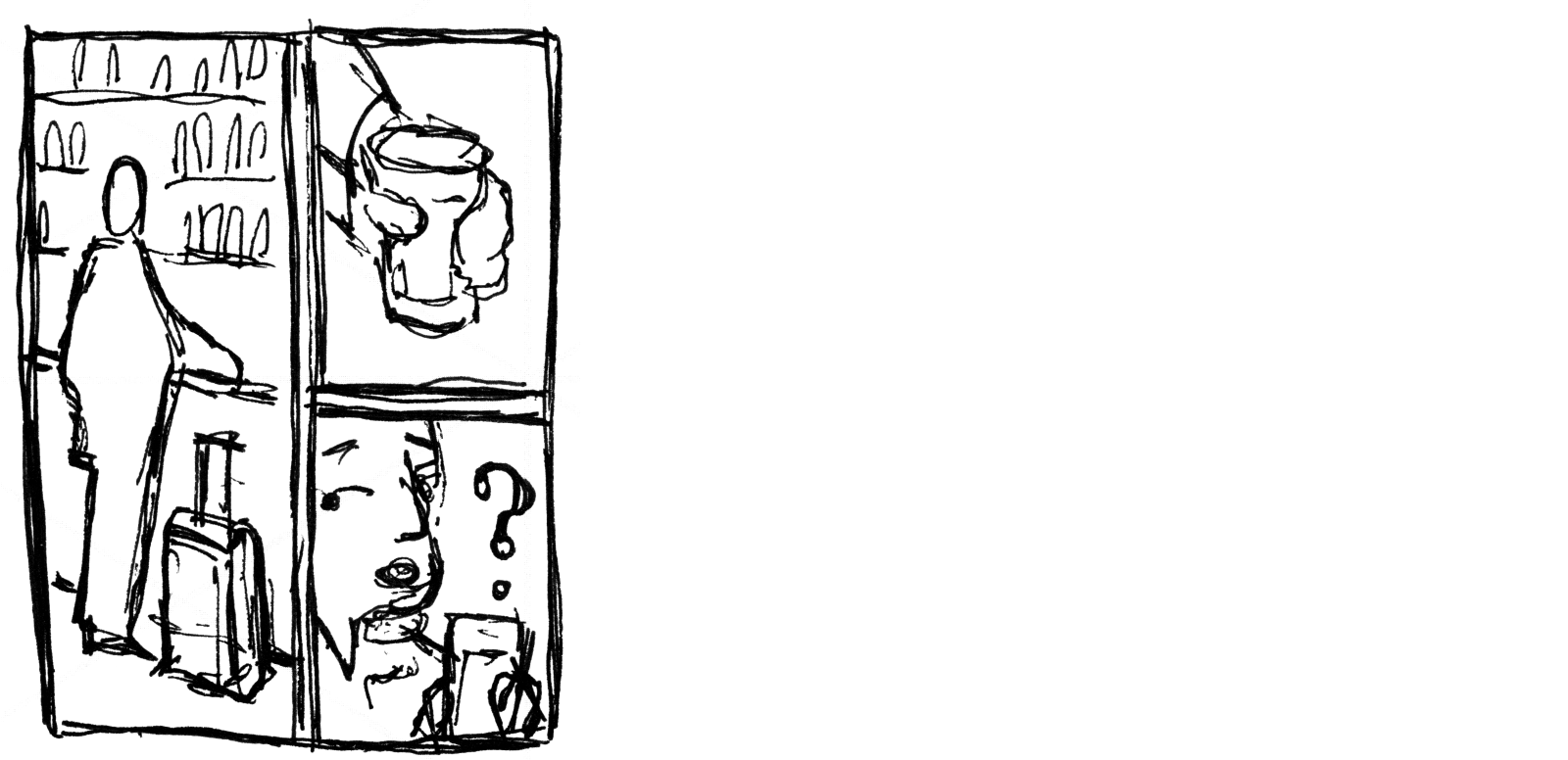
Panel 1: Jack stands at a bar. A carry-on suitcase is standing next to him. At the back of the bar are shelves with bottles of liquor.
Panel 2: Jack has just lifted a glass of beer.
Panel 3: Jack is about to take a sip. His hand that holds the beer is floating in space. He is looking sideways, surprised, puzzled.
Page 3
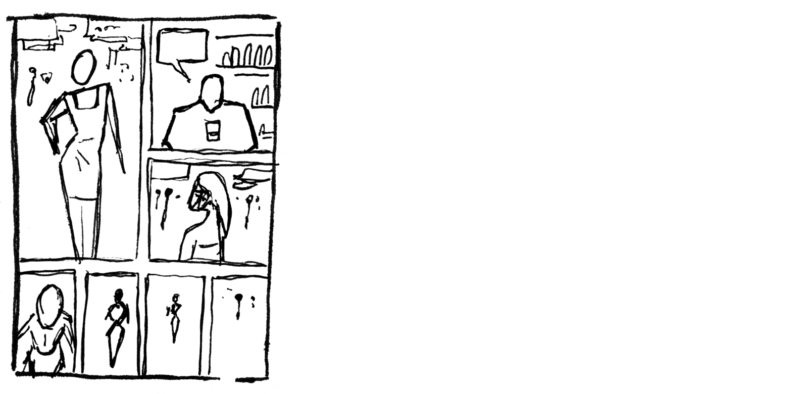
Panel 1: LINDA, 20s stunning blonde, in a red pencil dress, in a seductive pose, a hand in her side.
Panel 2: Jack looks at her, frozen, nailed to the floor.
........JACK: Can I eh... buy you a drink?
Panel 3: Linda is turning, still smiling at Jack seductively.
Panels 4-7: Linda is walking away into the airport hall. She is smaller in each consecutive panel until she is a mere tiny figure in the distance.
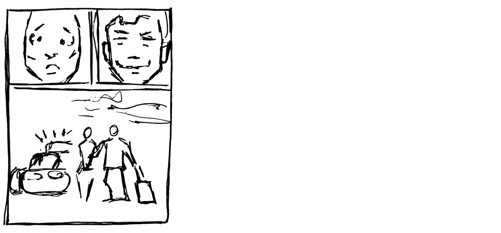
Page 4
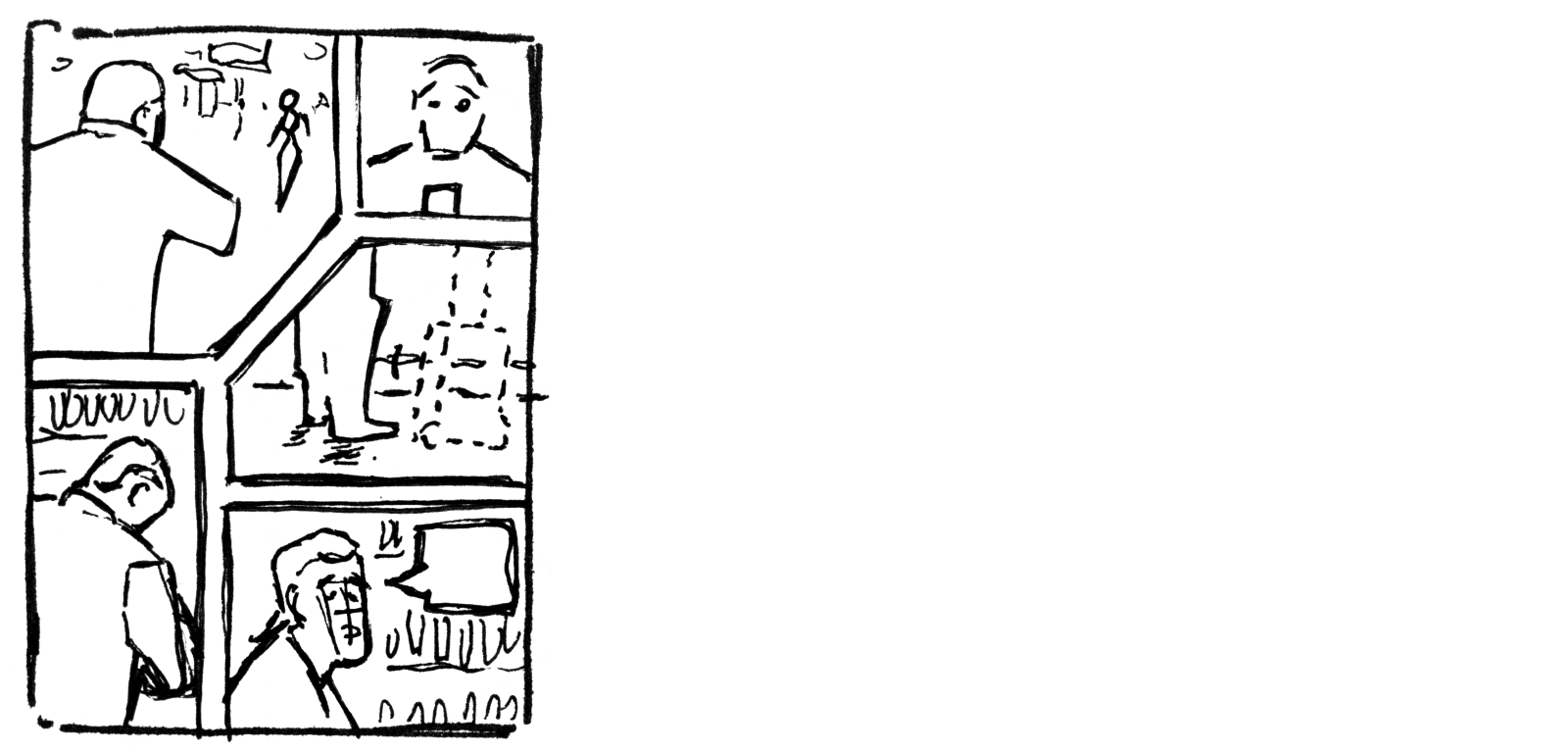
Panel 1: Jack is looking at Linda as she is walking away. She is already in the distance.
Panel 2: A smirk on Jack's face. He wishes she'd stayed for a drink.
Panel 3: Jack is looking down, to his side where his carry-on suitcase stands (off-panel).
Panel 4: Jack's legs. And next to them, nothing! His carry-on suitcase is gone! A ghost image of the suitcase is shown where it used to be.
Panel 5: Jack looks into the airport hall.
........JACK: Goddamnit.
Page 5
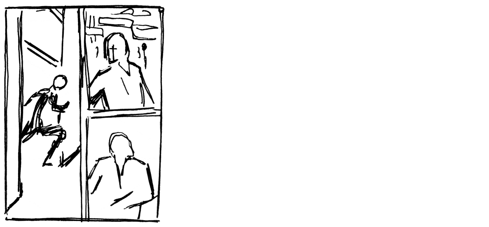
Panel 1: Jack is running out of the part at high speed.
Panel 2: Jack is standing in the airport hall. He is looking one way, looking around him.
Panel 3: Jack is looking in another direction. He is searching.
Page 6
Panel 1: Linda is walking outside the airport. She is not wearing an inconspicuous long coat that covers her pencil dress. A guy is walking next to her. He has Jack's carry-on suitcase.
Panel 2: A guy is whispering into a mobile device as he is looking at Linda and her companion pass him by.
Page 7
Panel 1: A police car is screeching to a halt before Linda and her accomplice.
Panel 2: Linda is looking behind her with a look of shock, surprise and horror on her face.
Panel 3: Jack is standing in front of her with a triumphant smile on his face.
........JACK: You are under arrest.
Page 8
Panel 1: Linda is looking shocked, stunned.
Panel 2: Jack is looking back with a satisfied smile.
Panel 3: Jack is leading Linda to a police car. Her hands are cuffed behind her back. Jack is pulling his carry-on suitcase.